

NamPower happy with N$235k 'rebranding'
Power utility NamPower says it is happy with the work done to “re-energise” its logo, which has not undergone any significant change in its 22-year history.
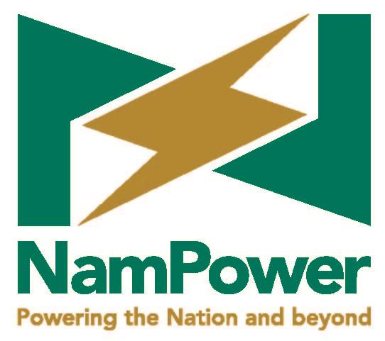
NamPower this week introduced its new logo, which it says is an improvement on the old one and formed part of a bigger project, the creation of a corporate identity manual.
When comparing the old and new logos, NamPower's pay-off line “Powering the Nation and Beyond” no longer appears in italic font and there are slight changes to the green and gold corporate colours.
“The refreshing of the logo forms part of a bigger project, the production of a comprehensive Corporate Identity Manual. The production of the 120-page manual cost the company
N$235 000, which included the development and printing of a number of copies,” said NamPower.
Fraudulent activities
The company added that it had witnessed an increase in fraudulent activities and felt a logo retouch would help stop such activities from taking place. “NamPower saw the need to communicate the change, though subtle, to inform its stakeholders about the change. This is especially given the fact that we have recently experienced fraudulent communications being sent around to especially suppliers in the name of NamPower,” the utility added. According to NamPower, the shape of the logo is now more square than rectangular.
Outdated
“The font of the slogan 'Powering the Nation and Beyond', which was cursive and outdated, is more structured and legible. The corporate colours have changed slightly to a more appealing green and gold colour,” it said. According to NamPower, the logo design was done by Pure Publishing and Advertising CC.
Asked for comment, branding specialist Pierre Mare said there is nothing wrong with a company retouching its logo, but it needs to be well executed.
“I can say that the practice of announcing a change in a visual identity is not unusual. This is due to a high degree of brand equity in the visual appearance. What happens is that when a logo changes there is often a degree of confusion and mistrust, sort of like waking up and discovering that your house has been rebuilt while you were sleeping. If it goes wrong, it can have a massive impact on the business or product,” he said.
Comments
Namibian Sun
No comments have been left on this article